
Tuesday, May 6, 2014

Tuesday, April 15, 2014
Stupid Pants
I am currently working on a painting of the man in one of my photographs, posted below, and as I become increasingly frustrated by the textures of his clothing, I'm asking myself, "Annie, why did you choose a subject who's image is 90% clothing and 10% face, when you like painting expressions and faces?" I then realize that the other two pieces in this tiny series also have tricky textures, meaning I had made this daring decision to paint full figures in all of their splendid khaki and denim, months ago.
Why am I choosing to paint so many features that I don't like to paint?
Well, besides the fact that, in theory, I will improve my technique through shady fabrics (I wanted that to be a pun, but I think it just might just be an appropriate adjective), I want something more out of these paintings than the process. I came to this idea through an artist whom I greatly admire, John Baldessari. John Baldessari believed that art was meant to achieve a final purpose that was less about the process and more about the final message or state. I agree with this. While I love art because it's a relaxing and creative outlet, I care about the final perceived idea.
I recently learned about a form of dance, called Gaga, that is purely about the way that the dance feels while you are doing it. And, like yoga or meditation, it feels great! It's really fun to dance in a way that only subscribes to a form and a method that you make in the process of doing it. But, I think that that is a different kind of art. It's therapeutic and it's educational, but it's personal and not communicative.
So, I realized that I didn't decide to paint the tricky pants and the frustrating jacket because it was going to be relaxing. I chose to paint them because I knew that the image of the man standing on the street holding an unidentifiable box was the idea that I wanted to show people. And, while it may stress me out and slow me down, I now realize that my mission in art is to see my ideas happen in their finality, and that I'll have to relax with Milano cookies and 30 Rock at another time.
A piece by John Baldessari:

A piece by John Baldessari:
Tuesday, March 4, 2014
Renoir's moment.

This is a painting by Renoir.
It's beautifully crafted. The composition, the light, and the color are all delightful. And, it immediately catches your eye as a perfect portrait of a elegant woman at the dawn of the twentieth century.
I love most of Renoir's work. He created many dreamy portraits and social scenes that vividly capture the culture and the mood of this key turning point in history. Yet, this one stands out to me as a landmark, not only in his career, but of all portraits. He captured a pure expression. An expression of expectancy, of satisfaction, and of light. Throughout the history of portrait painting, there are countless images of overly posed subjects, who lack raw emotion and who are frequently expressing an idea that someone has chosen for them or that they have artificially created. This painting shows a woman who was caught up for a moment in the hallway as she was on her way to an extravagant party. This portrait looks like a real moment of her life, which is especially unique at a time when cameras weren't all too easy to cart around. Moments couldn't truly be captured in their most basic, intriguing form. The light on her face looks natural, like it wasn't perfected in a studio. Her hands look as though she just clasped them in lighthearted exasperation. And, her face calmly asks you to hurry up, because you're going to be late.
The following images are portraits that are beautiful, but just not the same.


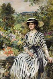
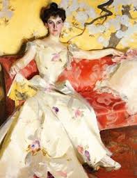
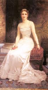


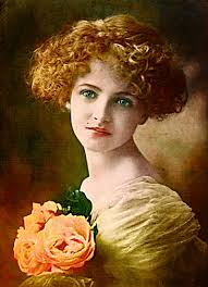
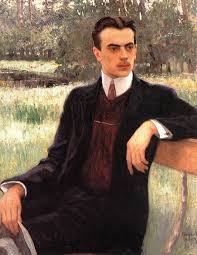
The following images are portraits that are beautiful, but just not the same.
Sunday, February 23, 2014
Why people?

Recently, someone observed that my art focuses on people.
And, it, almost exclusively, does.
This man, shown above, is the subject of the next painting that I have in mind. In contrast to the excited girl and the pensive boy, this man is older and has a look of experience and perhaps a little annoyance. Similar to the other photos that I've painted from, this was taken on the streets of Manhattan. I've found that I've been seeing certain connections between the two finished pieces and this idea of one. The boy and the man both have an object (the boy has a train), and they are both looking at something to their right. The girl and the boy both have white shirts and have youthful poses. The man looks utterly weary, but his clothes have similar textures to those seen in the first two pieces. These are random observations, but they connect to my passion for people.
I've always loved observing, studying, and understanding people. This passion is evident in almost all of my work as it highlights expressions, characteristics, and movements (one of the reasons that I love dance is that it's art you can actually be as a person). While the following observation is a less art related, I think I belong to a people-obsessed generation, with Humans of New York becoming a world wide phenomenon, personality quizzes consuming the internet, and the drastic rise of psychology majors in colleges and universities. And, as someone who religiously follows HONY, completes numerous personality quizzes daily, and may very possibly become a psychology major, I think people are the best subjects for art. I think art should be a beautiful idea, whether that beauty looks ugly or strange, art conveys a thought. And, people are endlessly confusing and intriguing all at the same time, so I continue to obsessively photograph, paint, and observe them, as creepy as that sounds.
And, that is why- people.


Tuesday, February 4, 2014
Watercolor experiments.


I am currently working on finding a subject for my third multi - canvas painting. So, I decided to take this awkward-in-between place to show two small paintings that I did in my spare time.
These are two watercolor pieces that I did at home. I have very little experience with watercolor, but I've always loved it. The paint is unpredictable and magnificently sneaky. I found the most control when I used slicker paper because I could move the color and dilute it more effectively. I liked the way I could push the color around when making the structure of the face. It's very easy to create bone structure by diluting the color at the highest points of the bone and then by having softer shadows. More generally speaking, watercolor is great for shadow. You don't have to have ten different shades of the same color (as you would have to have with other paints), because you can simply add water. You can also add water that is tinted with a different color, which creates a more unique shadow. Under the cheek bone of the second woman's face, you can see that I shaded her face with red, which is not the color of her skin.
With the first face, I was attempting to capture the features of my friend by exaggerating her eyes and her mouth. I was focusing on the style of my favorite New Yorker cover artist, who uses watercolor and ink. He frequently paints people who are well known, and he makes them recognizable by exaggerating their features in a way that still leaves a layer of the painter's vision while still having the click, in the viewers brain, of who the person is. I also wanted it to look like the blue was enveloping her.
The second face is from the cover of a book. I left half of the face two dimensional to emphasize the drama of the other half. The brown strip along the side stemmed from an accident with her hair, and the blue bow-like object stemmed from my obsession with blue. The drip going down her neck was also a mistake, but I was excited about it because it's another unique benefit of working with watercolor.
Wednesday, January 22, 2014
Number 2.


This is the piece that I just finished. It is the second of this collection. All of the paintings in this collection are each made up of multiple canvases put together, and each will be of a single figure. My last one was the boy looking over his shoulder. So far I plan to create a third, and then see if I'd like to do another one after that. The boy looks pensive and curious. The girl looks ecstatic. I'd like the next one to have a new idea or a new emotion so that the three contrast each other.
Saturday, January 11, 2014

Tuesday, December 3, 2013
Next Painting

This is the next photo that I'm painting. I took it in Manhattan, last summer. So far, I have him on six different small canvases, and I'm thinking of adding more on the bottom (where the chalk is). I had the idea to use chalkboard paint for the ground, and then viewers could draw in what the chalk designs are, but I'm not sure if it will work.
I love the movement in his body. You can tell that he just spotted something, or noticed the drawings. The light hitting the side of his face is also really lovely. And, overall, he's quite darling.
I'll post a photo of the painting when it's a little farther along.
Tuesday, November 12, 2013


This is the piece that I am just finishing up. For this piece I started with a photograph that showed the little girl dancing in the street. I was looking for a new image of dance, and I love her effortless, dramatic pose, but I wanted to paint it in a way that gave her action meaning. While looking for other images, I found a painting of the woman seen in the background. In the painting, she is leaning against a wall in an alley, with a gun in her hand. I like how everything about her seemed strong, dangerous, and dark. So, I decided to combine the two figures to create a juxtaposition of the different qualities. I'm planning to paint smoke in the background.
Monday, October 28, 2013
Here are some paintings that I worked on over the summer. I'm hoping to tie them into my upcoming project.


For these paintings, I really focused on light and the dimensions of the face. In the first three paintings, I worked off of photographs that I took. The last painting is partly from a photograph that I found in a book, and some of the features are from another one of my pictures.
My favorite piece is the first one. I like that the expression on the person's face seemed a little different every time that I looked at it. Generally it looks frustrated, or even angry, but sometimes I see a confused expression that draws me in. I think that this piece has lighting that is dramatic, yet tangible. The lighting sets off the fish eye view, giving the entire expression a slightly different meaning. The person is looking at the viewer closely. I would love to receive any thoughts on what the situation might be, in the comments section below. In the projects that I am now starting, I will be focusing on faces. Expression will be my key goal, but I'm going to try to paint people in a way that lends to a story and a character.
My Dancers
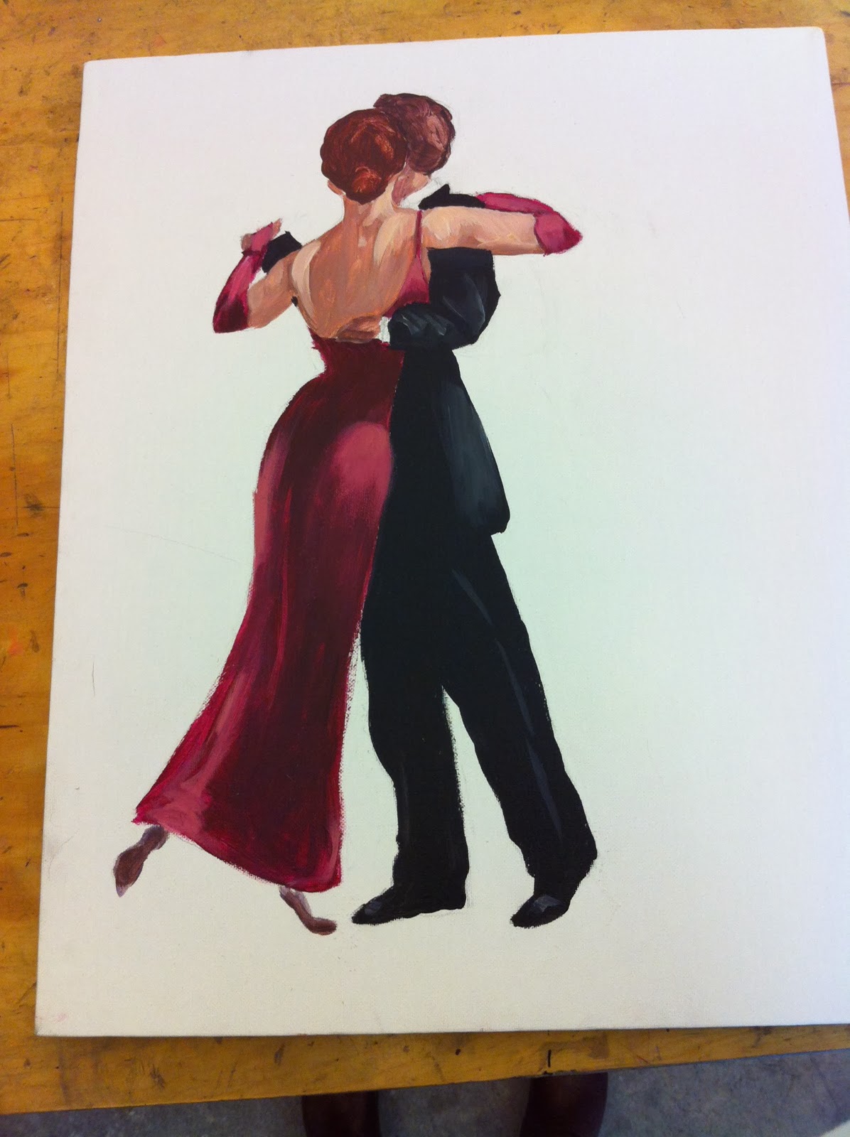
This is the painting that I have been working on. I'm not sure what I would like the background to be, but I think I would like it to have some sort of message, as seen in the works of Vettriano and Banksy. If you have an idea, feel free to comment!
Thursday, October 17, 2013

Banksy chose to make a political statement when he decided to work with Vettriano's painting. Banksy drew on the image of affluence that Vettriano created, and showed a different side to this upper class image. I believe that he wanted you to connect the wealth of the dancers, and the presence of butler, with the environmental crime that is happening behind them. Vettriano puts you in a surreal world where this couple is dancing in some endless landscape with their servants catering to their needs. Banksy takes this romanticized idea, and changes the fundamental message with a small alteration.
I love both versions of the painting, and I am very drawn to Banksy's political undertone. I am attempting to tackle this image myself, and, so far, I have painted just the couple on a small vertical canvas, and am now trying to wrap my head around a background for whatever message I would like to convey. My message might not necessarily be political for this painting, but I would like to paint a background that changes the reason why the dancers are present. Vettriano provides little explanation for why the dancers are where they are, but his painting is intriguing and charming nonetheless. Banksy connects the dancers with the oil industry. In this way, I would like to change the 'why' behind the dancers in a totally new manner, from that of Vettriano and Banksy.
Tuesday, October 1, 2013

This painting is called "The Singing Butler", by Jack Vettriano. I discovered a different version of this painting by Banksy, a year ago, and absolutely loved it. The entire scene is perfectly crafted. The dancers are in such a strange setting, which is immediately offsetting and intriguing to the viewer. They're outside, and there is nothing on the horizon. The ground seems to have water on it, as though it has just rained, and it looks as though it is a solid floor. This strange setting is set even further out of context with the presence of the maid and the butler. I love the technique, the lighting, the colors, all of it.
This painting is my inspiration for my first project.
I am especially intrigued by the image of two people dancing together. My first piece is a small acrylic painting on canvas of the dancers in this painting. I don't have a comprehensive project formed yet. I know that I would like to work with the image of the dancers. I plan to use paint and image transfers. At some point, I would like to paint the dancers on an image of a modern day setting.
Subscribe to:
Posts (Atom)